Bold Colour in 2026: What’s Actually Trending in Vancouver Homes Right Now
A few years ago I wrote about the return of bold colour and pattern - that resurgence hasn't slowed down, but how it's used has changed.
Instead of colour everywhere, homeowners are getting selective: one confident colour moment against a warmer, softer neutral, rather than pattern-on-pattern throughout the house. If you loved the original trend, this is what it looks like once it's matured.
Here's what's actually showing up in Vancouver homes this year, and how to use it so it still looks right in five years, not five months.
Think of this as the sequel to our earlier piece: same permission to be bold, sharper rules for making it last.
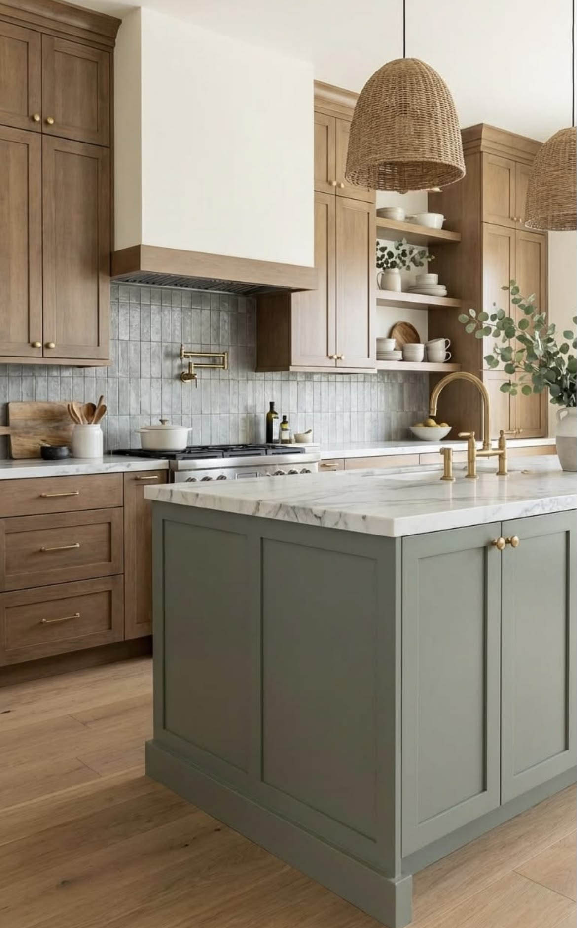
Where the Bold Colour Trend is Headed in 2026
Pantone's 2026 Colour of the Year is Cloud Dancer - a soft, quiet white, chosen as a counterpoint to a few noisy years of maximalism.
That doesn't mean bold colour is over. It means the backdrop got calmer, so the bold moments actually stand out instead of competing with ten other loud choices in the same room.
In my work with Vancouver clients this year, that's the shift I'm seeing: one saturated colour, chosen deliberately, instead of colour as a blanket strategy. It's not a contradiction of what we wrote before - it's the same trend growing up, using that permission with more restraint.
Photo Source: Pinterest.com
The New Neutral Backdrop
Warm minimalism is doing a lot of the work in 2026 - creams, warm whites, and soft greiges replacing the starker greys of recent years.
Think Benjamin Moore Pale Oak territory rather than a cool, flat white. It's not a retreat from personality; it's the canvas that makes a bold choice read as intentional rather than accidental. This matters more in Vancouver than most places - our grey-sky months wash out cool, stark palettes fast.
It shows up in materials too. The same shift is pushing quartz and stone selections warmer - less stark marble-look, more warm-veined stone that plays well with terracotta or clay. Choose your stone and paint palette together, not stone first with paint catching up later.
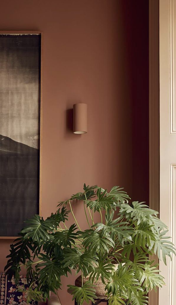
Where Bold Actually Earns Its Place
Rather than colour-drenching a whole room, the moves working best right now are contained: a lacquered powder room, an island in a saturated tone against otherwise quiet cabinetry, one deliberate millwork statement.
It's more livable too - a full room in bold pattern is expensive to undo, while one statement element gives you the same personality with far less risk.
I worked through this on a Kitsilano kitchen recently: the client loved a deep, saturated green but was nervous about committing a whole room to it. The answer was the island only - evergreen lacquer, warm oak surrounding cabinetry, brass hardware. It reads as confident, not risky, because it's one clear decision surrounded by quiet, well-made choices.
Photo Source: Pinterest.com
Vancouver-Specific Colour Choices That Work With Our Light
The palette actually working here leans into what's already outside the window: warm terracotta, muted sage, clay, deep evergreen.
Sherwin-Williams Evergreen Fog has shown up in more than one consultation this year - it reads as sophisticated because it echoes the coastal forest, not a colour chart.
That's the real West Coast Modern principle: materials and colour that belong to this specific place, not a palette that would look the same in Toronto or Palm Springs. A Vancouver home surrounded by cedar and fir doesn't need to borrow a palette from a magazine shot somewhere sunnier - the colours are already outside.
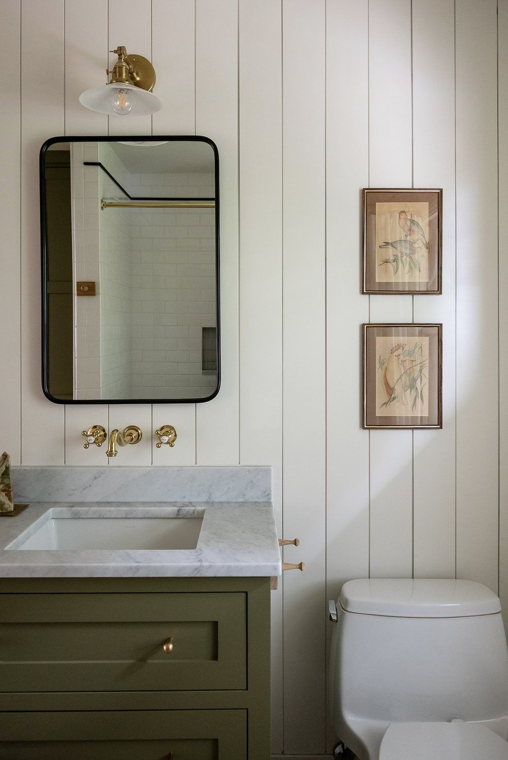
How to Avoid it Looking Dated in 3 Years
The bold colour choices that age well share one thing: they're paired with real materials and architecture, not just paint.
A saturated tone on cabinetry with real wood grain and solid hardware ages very differently than the same colour on flat MDF with trend-driven fixtures. The colour isn't what dates a room - the cheap execution around it is.
My rule with clients: commit fully to the bold choice where you make it, and keep everything else quiet and well-made. And check your motive - a colour you genuinely love still works in five years; one you picked because it was everywhere on Pinterest usually doesn't.
Photo Source: Pinterest.com
FAQ
Q: Is bold colour still in for 2026, or is everyone going back to white?
Both, in a way - the backdrop is trending warmer and quieter (Pantone's Cloud Dancer reflects that), but bold colour hasn't disappeared. It's being used more selectively: one confident moment instead of colour everywhere.
Q: What’s the safest way to try a bold colour without committing my whole home to it?
Start with something contained and changeable - a powder room, a kitchen island, a piece of millwork - rather than a full room. Low risk, high impact, easy to evolve later.
Q: What colours are actually working in Vancouver homes right now?
Warm terracotta, muted sage, deep evergreen, and warm clay tones - colours that echo the coastal landscape rather than a generic trend palette.
Q: How do I make sure a bold colour choice doesn’t look dated in a few years?
Pair it with real materials and good hardware, not paint on a budget surface. The execution around a bold colour choice is what determines whether it ages well.
—Samena, HART HOUS
Where to Start
If the idea of a bold colour moment appeals to you but you're not sure where it belongs in your home, that's exactly the kind of decision worth a second set of eyes before you commit to paint or cabinetry.
Read our original piece on bold colour and pattern for the full backstory, or explore HART HOUS e-design packages if you want a plan for where colour should - and shouldn't - show up in your space.